
The Craft Behind Every Design Decision at Papr
From a folded sheet of paper to an infinity loop, and from 240 pixels to 96: how we design software that works while you're not looking.
Shawkat KabbaraOctober 5, 2026
TL;DR
Chat should not be the primary interface for AI. Chat is useful for asking. The work itself should happen in the background and arrive as small, personal software you can inspect, use and own.
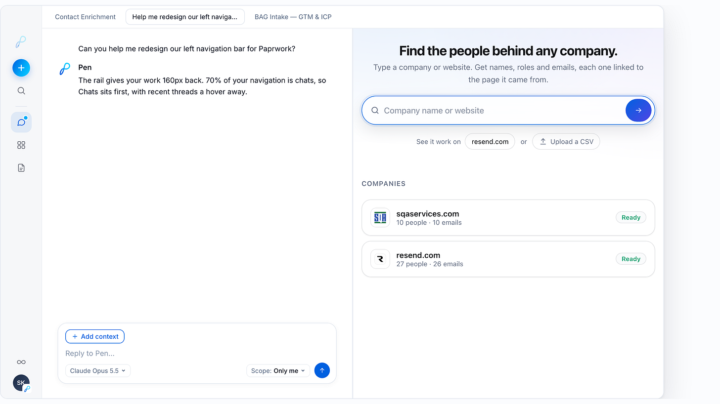
We rebuilt Papr Work’s left navigation around three questions: Where am I? Is my agent working? Does anything need me right now? The answer to the last one should almost always be no.
The brand is in the details. Our logo took five versions to go from a folded sheet of paper to a single infinity stroke. Our agent’s eyes are that loop, the same path as our Memory icon. Your agent sees through what it remembers.
No spinner. While the agent works, one point of light traces its own outline. If that light ever lies, people stop trusting it.
Craft is mostly deleting. Our favorite detail lasted two days.
We deleted our favorite detail
Last week we shipped a ring around your avatar in your org’s color.
It was lovely. It answered a real question: which workspace am I in? A lot of us work across three or four orgs now. Our company, a client, a side project.
Two days later, we killed it.
Nothing was broken. But a color is something you have to remember. Violet means the client. Blue means us. A logo is something you just recognize.
So your avatar now wears your org’s logo as a small white tile, like an app-icon badge. It’s quieter, and you don’t have to learn anything.

That’s the whole post in one decision. Craft isn’t adding polish. It’s knowing what to delete, even when it’s yours.
The most important thing we deleted was the agent
Here’s the contrarian belief underneath our design decisions: chat should not be the primary interface for AI.
Chat is a good way to ask for something. It is a terrible place for the work to live. A blank box makes you restate the job, supervise each turn and dig through a transcript to find the result. Even when the agent can run on a schedule, the output is still often another chat turn sitting on top of someone else’s software.
At Papr, we try to delete the agent from the center of the experience.
The agent should do the work in the background. What it delivers should be small, personal software shaped around the job: an account-research table, a pipeline review, a customer-onboarding tracker, a dashboard you can filter and act on. You come back and open the app, not the conversation that produced it.
That changes what design craft means. The goal is not to make the agent more present. It is to make the work more usable. Your screen. Your fields. Your rules. The agent becomes infrastructure inside the app; the app becomes the thing you consume, change and own.
We still keep a small trace of the agent in the rail, because invisible work needs an honest signal. You should know when it is working, what it is working on and whether it needs you. But the agent doesn’t get the whole screen just because an LLM did the work.
Chat is how you ask. Small software is where the work lives.
The interface’s job flipped
Most software shows you what you’re doing. Papr Work also has to show you what is happening while you’re away: work moving across apps and chats while you’re in a meeting, on a walk or asleep.
That changes the brief completely. An agent can generate infinite activity. If the interface reflects all of it, you get a slot machine.
So every pixel in our new navigation rail has to answer one of three questions:
Where am I?
Is my agent working, and on what?
Is anything worth my attention right now?
Everything else lives one hover away.
Steve Jobs’ father told him to finish the back of the cabinet, even though nobody would see it, because you would know. Jony Ive says simplicity isn’t the absence of clutter. It’s bringing order to complexity. I think agent software needs that discipline more than any category before it. The complexity is real, and it’s running in the background, all the time.
The prompt we design with
We prototype almost everything with agents. The brief is the same every time:
Use the Papr Design System skill. Less is more. Focus on one job to be done. Use simple, modern, minimalist design. Think Steve Jobs meets Elon Musk: taste plus first-principles thinking. Use the latest research publications in user research, design and user experience.
The design system is open source. It’s built into every Paprwork install, so you can read exactly what our agents read before they touch UI.
For motion, the brief is shorter:
Pick one creative concept and execute it flawlessly. Keep it simple.
Every animation file we ship opens with a comment naming its one concept and the research behind it. If we can’t write that comment, it doesn’t ship.
240 → 80 → 96
The old sidebar was 240px wide. When we looked at how people actually used it, roughly 70% of clicks went to chats. We had a 240px panel serving mostly one job.
So we cut it to an 80px icon rail. Chats, Apps and Docs open hover peeks with your pinned favorites and recent items. Nothing was removed; it just stopped taking up space when you weren’t reaching for it.
Then macOS 26 shipped bigger window controls (the red, yellow and green buttons), and at 80px they crowded the edge. It’s the kind of thing you only notice after living with it for a day.
We went to 96px. It clears them with room to breathe and still hands 144px back to your work. And because the rail is that slim, we deleted the hide-sidebar button entirely. It never needs to go away.
Where the loop came from
Our logo went through five versions before it earned its place. Each one taught us something the rail would need later.
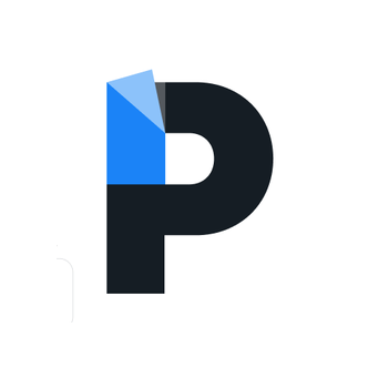
1 · Paper. The first mark was literal: a heavy P with its top corner folded down, like a sheet of paper. Papr, paper.
It was clever. That was the problem. It said documents, and we were building memory. And the fold only read at large sizes. At 16px it was a dark blob with a blue corner.
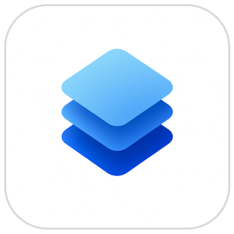
2 · Layers. So we drew memory instead: three glowing layers, stacked like context piling up over time.
Closer to the idea. But it could have been anyone’s logo. Stacked layers is the icon for, well, layers. It described a feature. It didn’t say anything about us.
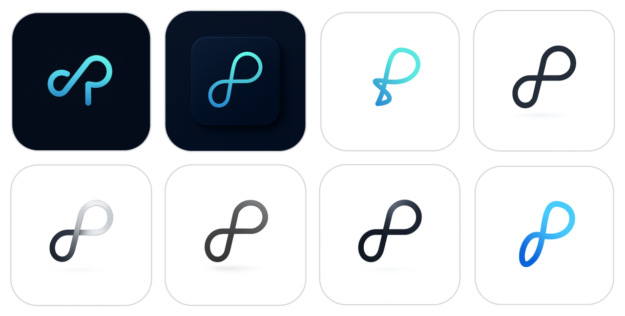
3 · Infinity. Then the idea that stuck: memory that doesn’t run out. We put a P next to an infinity sign, then tried to make them one stroke. Then it got messy.
This is the part nobody shows. An ∞ and a P sitting side by side. A version that tied itself in a knot. Thin monolines in navy, teal and black. Silver and chrome material studies. Tiles inside tiles, and a dotted grid behind the mark. Dozens of them.
4 · Simplify. Then we started deleting. The grid went. The tile inside a tile went. The chrome went. The knot went. What was left was one continuous stroke, a P whose bowl loops into infinity, leaning forward. We made it heavier so it would survive at 16px, and gave it one gradient.
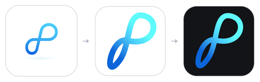
5 · Papr. One stroke. One gradient: brand blue to sky to cyan. Never flat-filled, never redrawn. Next to it, “papr” in lowercase, because we’d rather be approachable than loud.
For Papr Work, the mark sits inside one drop of liquid glass, the same droplet every mini-app icon lives in.
Looking back, it’s the same lesson the org ring taught us last week. The clever version was never the right one. Every version made the mark say less, and mean more.
The eyes are the logo
That loop is also why, when we gave your agent a face, we didn’t draw new eyes. We used one infinity loop, the exact same path as our Memory icon. Your agent sees through what it remembers. It’s infinite memory, and an agent that keeps working when you stop.
Internally, we call it the little ninja.
It has one motion concept: it notices you. The eyes glance toward your cursor, about 2px at most, then settle. They blink at irregular intervals, every three to six seconds, sometimes twice. A fixed rhythm reads as a machine. An irregular one reads as alive.
Two pixels of glance does more to make an agent feel present than any amount of chrome. Humans follow gaze before we can talk.
A spinner says “wait”
It doesn’t say who’s working, or on what. It’s the same on every app on earth.
We replaced it with Replay. While your agent works, one point of light with a short comet tail travels around the agent’s own outline. It’s modeled on hippocampal replay: when your brain consolidates a memory, it replays the sequence as activity sweeping along a path. For a memory company, the metaphor chose itself. The mark is the indicator. No new shape.
Two things I didn’t expect:
A single missing unit broke it. Chrome refused to animate the light smoothly until we wrote the dash offsets as lengths (1px) instead of bare numbers. Without that one invisible unit, the light jumped instead of traveled.
The light has to be honest. After launch, we noticed it going dark while Pen was still working. Between steps, a chat running a tool isn’t technically “streaming,” so the rail stopped counting it. We fixed the signal so a chat counts as working for its whole turn.
That bug taught me the rule I care about most: if the light ever lies, people stop trusting it. An animation is only as good as the truth underneath it.
The nudge that almost never fires
Most apps get your attention with a red badge. It works. It’s also why everyone has 4,000 unread notifications.
Our version is called The Lean. When something slips, like a goal due in two days with under an hour logged, your agent leans out of the rail toward you, like a colleague leaning over your desk. One dot slides out and opens into one sentence with one next step and a polite way out.
No red. No bell. No badge count.
But the craft is almost entirely in when it doesn’t happen:
At most once a day, three times a week, on weekdays during working hours.
Every ignored nudge doubles the wait before the next one, up to a week.
It only appears at natural pauses: when you come back after time away, or a few seconds after your agent’s work lands. Never while you’re typing.
That last rule comes straight from interruption research. The same interruption costs far less at a breakpoint between tasks than in the middle of one (Adamczyk & Bailey, 2004; Iqbal & Bailey, 2008).
The best nudge is the one you’d have asked for.
What’s in the lab
We’re now prototyping the opposite moment: when you’re genuinely ahead of your own plan.
The one I keep replaying is called High Water. One drop falls from your agent, and the window fills like a glass, rising past the line where your plan said you’d be.
For the top 1%, it doesn’t stop there. The edges of the window turn out to be the walls of a bottle. They close in around your water, it fills to the brim, and it becomes the real thing: a Papr Ocean Bottle, on us. Each one funds collecting 11.4 kg of ocean plastic, the weight of 1,000 bottles.
Why water? You can’t make a sheet of paper without it. Water is a source of life. Paper has been a source of work and collaboration for two thousand years. We named the company after paper, so we owe something to the water it’s made from. Being green isn’t a page in our deck. It’s in the product, at the moment you’re proudest of your work.
We set strict rules for it:
Earned, not claimed. Only progress from a connected source counts. No self-reported goals.
Rare. The top 1% of people this month, and only once.
Never advertised. No progress bar toward it. Expected prizes crowd out intrinsic motivation; surprise ones don’t (Deci, Koestner & Ryan, 1999).
Half of it is giving. Giving lights up the same reward circuitry as getting (Harbaugh, Mayr & Burghart, 2007). The bottle is yours. The ocean is the other half of the prize.
The other one is called Fold. A drop leaves your agent and opens into a blank sheet of paper. It folds twice, white then your agent’s color, into a paper crane. The crane flies along your timeline, which is drawn as a dashed line (in origami diagrams, a fold you haven’t made yet), and turns it solid as it passes your plan.
Paper becoming Papr. Fold makes something on screen; Bottled makes something you can hold.
And it closes a loop I didn’t plan. Our very first logo was a sheet of paper with a folded corner. We cut it for being too literal. It came back as a crane.
Building it taught us one more rule. Our first version of Fold slid the paper straight out of the agent. It looked fine alone, but next to our other animations it felt like a different product. So we rebuilt it to start from the same drop that begins High Water. A family of animations should share a first frame.
Five rules I’d steal for any agent interface
Quiet by default. Most of the time, the right amount of motion is none.
The agent is the signal. Express status through the agent’s own mark. Don’t add new shapes.
Honest motion. If it’s lit, it’s working. If it nudges, it’s true today.
Recognition over recall. Logos beat colors. Faces beat legends.
Delete your darlings. If something simpler does the job, ship that instead.
Why we sweat this
In 2007, Yahoo’s search-ads sales team ran on one guy’s Excel macros. The company hired a PM and twenty engineers to rebuild them. I was that PM.
Jim was doing the work. He just wasn’t allowed to build the software that ran it.
Our mission at Papr is to put the power to build software back in the hands of the people doing the work. For Jim, the software was a set of Excel macros. Today, an agent can build and run it. But the lesson is the same: the person doing the work should own the software that runs it.
That is why we are not trying to put a better chat box at the center of work. Chat is how you ask for something. The durable thing is the small software the agent leaves behind: shaped to your workflow, opened by your team and improved by a shared memory. Chat remembers what you said. Software remembers what you did.
And once the agent moves into the background, the few moments when it appears have to earn your trust. A light that tells the truth. A nudge that waits for a pause. A pair of eyes that remember.
Every detail matters. That’s the job.
The new rail is live in Paprwork, and Paprwork is open source. If you build agent interfaces, read the design system and tell me what you’d delete. Reply or DM. I’d love to compare notes.